Monday, January 25, 2010

Shot 004


This is so far the most complicated shot I've lit. Global illumination was taking way too long to render. If I used GI all the way, then I would never be able to finish my renders. Thus, I decided to fake GI using multiple light sources simulating bounce and specular lights. This shot has 16 render passes. The background outside the window, the kerosene flames and the interactive lighting on the book was all added during compositing in Shake. Alan and the rest felt that the glass was too clear and new and thus I made it translucent. This is the node tree from Shake:


Again, this was the most complicated script I've done. I realized that in Maya, I forgot to set up mask passes for the table elements and characters. Hence, the composite didn't turn out correctly. So I had to use the existing passes that I had rendered and extract alpha channels out of them and do a bit of rotoscoping to create mattes for some of the layers. In the end, it worked.

I was reflecting about the choice I took to use Shake as my compositing tool for this project and I can't help feeling relieved about the decision I made. If I had stuck to After Effects, all these matte extractions would have been tedious and confusing with the whole layer system in AE since it uses track mattes which requires two layers and then pre-compositing on top of that. I can imagine how messy and confusing my workflow would have been. The node-based compositing workflow makes my composite very organized and easy to troubleshoot. However, the downside of Shake is that it doesn't have many of the filters that AE has such as glows or lens flares or those Cycore Effects that come free with AE. I have to manually create some of these things procedurally, but hey, that's the whole fun part about Shake! :)

Anyway, do give comments on the lighting and how it makes you feel as the viewer and what kind of mood is emoted to you.

Tuesday, January 19, 2010

Shot 021 Clip


Pardon the H264 compression quality. To view a better version in HD, click here
Shot 021 - Look Development Update

Since the previous render was a little darker with 8 minutes of render time, I decided to make a few changes to make the image a little brighter and with much less render times.

Previously, I was using the mia mental ray shader to give the translucent glass effect, which I realized happened to be the reason behind the long render times. Thus, I changed the shader to a blinn and built a shading network to give the Fresnel effect. This dramatically cut down the render time to less than half, approximately 3 min 25 sec. Also, I increased the number of lights to 16 to give more specular glints to add contrast the scene.


Then, I broke the render down into render layers to increase render efficiency. I broke down to small details such as the glass of the lamp, the wires and the main body had their own separate layers to control the specular highlights during post. In total, I ended up having a total of 12 render layers:


I set up a naming convention system within Maya so that it would categorize all my renders appropriately and so that I wouldn't have to shift over any files to other folders later on. I left it to render overnight.

When everything was rendered, I brought it into Shake to composite. I did minor color corrections on the specular highlights to make them more bluish. I also did color correction on the whole to make more contrast to the shot. Finally, I faked a rack focus (depth of field) and rendered the shot:


The shot is being uploaded to YouTube right now as I speak. Once it's done, I would put it up here. Meanwhile, comments are most welcome.

Night Lighting - Look Development


This is my first time doing night lighting. I wanted to go for an overall moonlit feel since there was no source of light to illuminate the set. This is one of the shots after Angela's father puts out all the lights. From the first shot with the flame in the kerosene lamp, both Alan and my friends felt that the glass of the kerosene lamps were too transparent, so I made them translucent. I used a total of 11 lights for this shot as you can see from the set-up below:


This render took me 8 minutes to render - no compositing. So I need to break it down. Also, no final gather or global illumination was used. Feedback and comments are most welcome.

Friday, January 15, 2010

Shot 001 Rough Composite


I did this above to to see if I could save rendering time (it was very expensive!) and composite a shot using a single rendered frame from Maya - sort of those "fix in post" kind of stuff. But I realised that I needed to break down the render into layers, even though it could just be one frame, so that I could have control during compositing.

This is what the original frame looked like (direct render from Maya / mental Ray:


I brought this image into Shake and the first thing I did was to mask out the centre portion of the kerosene lamp and keep that in focus while defocusing everything else. Then, I needed to create the flame. For this, I thought I would use particles in After Effects, render it and bring it over in Shake. But I didn't want to go through the trouble of switching between programs. So I decided to create the fire procedurally in Shake using a few roto shapes. Here's the node graph:


Everything from the middle to the right makes up the procedural flame


The feedback I received was that the flame is moving too much and I need to tone that down. Other than that, the lighting was appreciated and I basically got what I wanted. However, Alan felt that he couldn't really read anything from this shot compared to that from my animatic. So I need to reframe the shot to enhance the composition. Feedback is most welcome.

Meanwhile, I started to animate. I', done with 9 shots (almost). I spent a lot of time working on the camera animation first before getting onto the character animation. I would set rough keyframes in the Maya timeline and then get into the graph editor and fine tune the frames until I get the result I want. This enabled me to stabilize my shot and know what I need to focus on when animating character. This helped me make decisions on which shots would I need to simulate cloth and which scenes can I fake it.

For instance, in one of the shots, I needed the composition to look like the one from my animatic:


But because of the way my scene was set up, Angela's father's head kept going out of the frame no matter how I adjusted the camera. So I had to cheat by moving the chair and the father down through the ground to get him in the frame.


I'm worried about the lighting. It takes ages to render, so I need to find a way to cut down the render times. I hope I have enough time so that I don't have to compromise on the lighting - after all, that's my primary aim for this project.

Wednesday, January 13, 2010

Rigging Complete & Subsurface Scattering Shaders

So Angela's model got approved finally and I got all the rigging done for both the characters including facial rigging. Now I would start animating. However, before that, I decided to set up the subsurface scattering shaders for both the characters. I took the 2K texture map that I created in ZBrush and brought it to Photoshop to convert various files for the subsurface scatter:


I connected all these various textures into the appropriate shader slots and adjusted the parameters till I was happy. Here's the result with two spot lights:


I used the same techniques for the arms, and here's an extreme result where the skin is super translucent (have yet to adjust the properties of the shader):


Feedback is most welcome regarding whether his skin looks natural or too plastic or any sort of feedback regarding anything.

For the time being, I shall move onto animating FINALLY! :)

Monday, January 11, 2010

Angela First Look

So this was a terrible frustrating process. But I think I do see a light now.

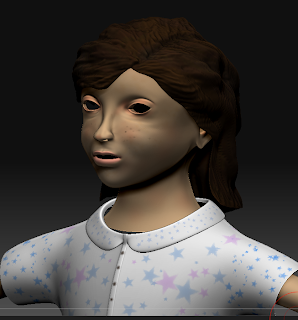
Based on the feedback given by Alan and the class from the mid point reviews, I made changes on Angela. I took her base mesh into ZBrush to sculpt and exported a normal map out. I also painted her texture by hand in ZBrush. Next problem was the hair. I spent an entire day trying to add dynamic hair to Angela but it kept giving me problems and I couldn't style it properly. I was really loosing my motivation to do things. I decided to try to model her hair, but I couldn't quite get success from that the first time. The second time, I modeled from a sphere and after a few hours, I got the basic shape I wanted and UVed it and brought it to ZBrush to sculpt. Oh, and I added eyebrows to sort of complete her. Here's the first look of a GIRL named ANGELA:


Still have to create the subsurface scattering shader for this girl to give a soft look to her skin.

Thursday, January 7, 2010

Random Shot Lighting Test


Well, it's 4.25 am right now and I was too lazy to do a proper composite... so I just posted the raw render that mental Ray spat out for me.

I am about to be done rigging Angela's father, and I had this sudden urge of putting him in the set and test out the lighting. As I had expected, I needed to light him separately. So this shot is supposed when he notices some explosion or war stuff going on outside his window and his attention had been caught. I used GI (standard setting I used to render the set previously) and I used separate lights for the character using light linking to give a strong keylight from the right and a slight fill from the left. Also added a backlight to the armchair to pop it out from the background a little more.

Of course in the final shot, there would be ambient occlusion passes and an overall glow and the character would pop out more.

Wednesday, January 6, 2010

Father Texture Update

Updated the textures of the sweater/shirt, pants and shoes.


Father - First Look


Textured in ZBrush. Details through normal mapping. All texture maps, including color and normal maps, are 2K in resolution. Rendered with mental Ray in Maya. No subsurface scattering as yet, but will attempt it later on.

Tuesday, January 5, 2010

Angela's Father Update

I finished modeling the rest of the body for Angela's father. Along the way, I made the decision of not using cloth simulation as the results given by normal rigging would be suitable for this character.


After modeling all the parts separately, I unwrapped them and brought everything into ZBrush where I started to sculpt. I didn't want to get too hyper on the sculpting, so I tried to be aware of that.


After I was done with the sculpting, I baked all the sculpted details into normal maps and re-exported the low-res meshes to be used inside of Maya. After applying the normal maps, this is what the model looks like:


The details looks slightly toned down, which is exactly what I wanted. I learnt a lot of ZBrush along the way. This would be my first time using this program for proper production work. I've never used it for my personal work either. I got to know and explore the Maya to ZBrush to Maya pipeline with the use of subtools and normal maps.

The most fun part about this process was that many of the meshes for this model is reused. The sweater is modified from Angela's inner torso used as a collision object for cloth. The arms are also Angela's with different proportions. Even the ears are being shared between the father and Angela.

So anyway, I moved onto rigging this guy. I laid out all the bones and control objects. I've yet to bind them and add IKs to the rig.


Sunday, January 3, 2010

Angela's Facial Expressions Test 001


Facial expressions, no jaw rigging as yet.

Father Head Model Update

I'm almost done rigging Angela, including her facial expressions. I'm uploading the screen capture I took of her expressions. I also started work on Angela's father head model.

I finished up the model in Maya and this is what it looks like:


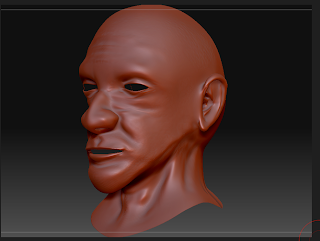
I modified the ears and the neck area. However, I thought I could bring out his features by bringing the mesh into ZBrush and sculpting it there. So I did unwrapped and UVed the meshh and brought it into ZBrush to sculpt. This is what the model looked like after that:


I added definition to the ears, the nose and the area around his upper lip and nose. I exported a normal map, which looked like this:


I exported the model with the lowest level of subdivisions and brought it inside Maya:


Here's the comparison of the sculpted mesh (in beige) and the base mesh (in grey):

Saturday, January 2, 2010

Set Lighting Update

Forgot to put this on... added soft glow to the entire footage. Composited in Shake..

Thursday, December 31, 2009

Character Progression

So after weeks of frustration, I guess I do see a little bit of light. I worked on Angela's head based on the feedback I received from friends and family members. I also started texturing the her head and her dress. As you can see, I did not pay much attention to her foot as there are no close-ups or even mid shots showing her feet. So that saved me a lot of trouble.


Here is the texture map I painted for Angela' head. I used my friend's photograph as a base to start the texture painting process. So, special thanks to her for that :) It is still incomplete though, I have to paint hair behind her right ear.


As for the normal map for the dress, I'm still having difficulty exporting it out from ZBrush. This is what it looks like after I generate it (I don't have Zmapper):


As for Angela's father, I'm pretty proud of of the model actually. This is what it looks like:


The only thing that is pulling the whole model down is the ear, which I plan to work on later on. The good news, however, is that Angela's nighty simulation is behaving more or less correctly. I developed an internal body model structure for Angela's nighty to collide on. Here's what it looks like:


Finally, I can start rigging her.